Sunday, October 31, 2010

ALL HALLOWS EVEN


Traditional jack-o'-lantern (left), designed by The Child and carved by TWT; and mummy jack-o'-lantern (right) designed and created by The Wife and The Child.

Saturday, October 30, 2010

BRAINS


Zombie cupcakes adorn the storefront window of Capitol Hill's Cupcake Royale.

DIA DE MUERTOS


The Child and I headed up to Seattle to join in the Dia de Muertos 2010 celebration hosted by Taller Mexicano para la Cultura y las Artes (TMCA) at Seattle Center's Center House. The Mexican festival honoring the departed was rich in imagery and culture and family and tradition. Especially beautiful were the various altars built for the deceased. They were filled with flowers and fruit and pan de muerto (bread of the dead) and candles and sugar skulls and artistic renderings of skulls and skeletons. Many of the altars also had items that the dead person or persons would have enjoyed in life—a bottle of beer, a bottle of tequila, a cigar, a stick of gum—that were temporary experiences, the emphasis primarily on temporary and experience.


There was also a large sand painting in the center of the Center House floor, as well as many pictures, sketches, linocuts, woodcuts, lithographs, and paintings depicting skulls, skeletons, and death. It was a nice reminder of how temporary we are, I am.

To highlight that point, The Child became ill, apparently from one of the various viruses drifting through the classrooms of the new school year. That cut our time short and sent us scurrying for the safety and comfort of home, for rest and stillness and hibernation.

Friday, October 29, 2010

READING W. H. AUDEN


Photograph by The Child.

W. H. AUDEN


I visited King's Books and Tacoma Book Center this afternoon, foraging the stacks, writing down possible gift ideas for Christmas. I didn't intend to purchase anything.

Then, the book pictured above made its way into my hands at Tacoma Book Center. I thumbed through W. H. Auden: A Tribute edited by Stephen Spender. I initially picked it up because I was looking to see if any of the books by or about Auden included his 1939 poem "Herman Melville" or any of his criticism of Melville's works.

I read this line from "A brother's viewpoint," a tribute by his older brother Dr. John Auden:
"As a brother of Wystan, older by just over three years, but lacking the craggy landscape of his face, and far removed from the catholic compass and depth of his intellect, to write of our youth brings back ancient friendships and jealousies."
Right then and there, I knew that this book was now mine.

Who writes like that nowadays? Nobody. And those lines are par for the course. These collected tributes from family, friends, artists, and literary luminaries were written in 1974 and 1975, shortly after W. H. Auden's death in 1973. They sing. They fawn. They speak truth. They are literature in their own right.

Wednesday, October 27, 2010

Tuesday, October 26, 2010

MOBY DICK RETOLD


"Moby Dick is considered by many academics to be the greatest work of prose fiction ever written. It was only because of Melville's refusal to simplify or condense his books to please his audience that he was able to produce this classic."
—pages 159-160, Moby Dick: Retold from the Story by Herman Melville by Henry Brook (Usborne Classics Retold)

---

Ah, the irony. The above quote is from a book that simplified and condensed Melville's book, I assume, to please a modern audience.

---

Moby-Dick (note the hyphen in the title, which is missing in the "retold" version) has existed in more than one version since the beginning of its publication. It was published in a censored British edition in October 1851 and an "original" American edition in November 1851. The British version removes anything that would be considered offensive to a standard British Victorian reader. Therefore, many references to sexuality, atheism, agnosticism, and anti-British sentiment were expurgated or reworked.

Moby-Dick has also been issued in many abridgments, condensations, and adaptations over the course of its more than one-hundred-and-fifty years of existence. In fact, it was a special issue of The Review of Contemporary Fiction (Summer 2009, volume XXIX) that once again sent me on a journey into the pages of Moby-Dick from which I may never return. ; or The Whale, edited by Damion Searls, was a direct response to Moby-Dick in Half the Time by Orion Books. ; or The Whale contained all of the words and passages that had been left out of Moby-Dick in Half the Time. It is a fascinating read that stops and starts. It is the novel equivalent of the cinematic jump cut.

This Usborne Classics Retold edition of Moby Dick continues both traditions. It is an adaptation rewritten and reworked for the "9 years and up" crowd. It combines and redivides the extracts, 135 chapters, and epilogue of the original into nineteen sections with titles such as "My Pagan Friend," "Ahab's Rage," and "Four Prophecies." It also "modernizes" much of the stylized language of the original, substituting simple English for the Shakespearean diatribes and King James Bible poetic ramblings that tumble from Captain Ahab's mouth.

---

In the June 2010 (volume 12, number 2) issue of Leviathan: A Journal of Melville Studies, William Hansen, in his article "So far as what there may be of a narrative": Abridgment and Moby-Dick, writes that
"These abridgments function, consciously or not, as an indoctrination on how to read. Since a majority of them were targeted towards children and young adults, an abridgment's explicit and implicit instructions on the value of reading can have a lasting impact on the reader." (page 32)
I hope to read Moby Dick, this retelling, this adaptation, in order to better understand how I read, and, more specifically, how I read Moby-Dick, with all of its bulk and digressions and over-the-top language intact and complete.

Saturday, October 23, 2010

WHITE RIVER DISC GOLF COURSE

I played my second-best round of disc golf, scoring a 59 (+5) at White River Disc Golf Course of Auburn, Washington on Saturday morning. Highlights included the following:

*Playing the first five holes in torrential downpour.

*"Losing" a white-colored driver in an open field of grass on a bad throw. A white disc in a field of green that I couldn't find after ten minutes of searching! Someone behind me found the disc and called me.

*The someone turned out to be the guy I played my first round of disc golf ever with: Larry.

*Even with taking the penalty for losing the disc and playing from where I think it landed, I threw a four for the hole, one over par.

*My back nine was the best back nine I have ever played, and it felt like it. 28 (+1).

*On many of my second throws on holes, I was hitting metal—the pole, the side of the basket, the chains, or the top of the basket.

*I almost had a hole-in-one on the final basket. The drive was perfect and landed one foot from the basket. I am glad I had witnesses. I didn't quite believe it myself.

---

Hole 1 - 3
Hole 2 - 4
Hole 3 - 3
Hole 4 - 4
Hole 5 - 4
Hole 6 - 4
Hole 7 - 3
Hole 8 - 3
Hole 9 - 3
Front nine - 31 (+4)

Hole 10 - 3
Hole 11 - 3
Hole 12 - 3
Hole 13 - 3
Hole 14 - 3
Hole 15 - 3
Hole 16 - 4
Hole 17 - 4
Hole 18 - 2
Back nine - 28 (+1)

Total - 59 (+5)

Friday, October 22, 2010

STREET BOTANY


The promotional postcard for Maria Jost's Street Botany exhibit at Fulcrum Gallery (left) alongside a TWT exclusive diagram of the north wall hanging of the same show (right).

---

Fulcrum Gallery presented what I believe to be their best exhibit to date. The "drawing prints" of plants and clouds by Maria Jost are absolutely stunning. I also realized that The Child and I missed part of the Street Botany exhibit by focusing solely on the prints.*

---

Maria Jost exhibited many drawing prints that consisted of India ink, pen, and collage on drawing paper and framed in minimalist black frames. These pieces combine Jost's scientific and artistic backgrounds in the perfect mixture. The images are fanciful and playful, yet organic and meticulously drawn.

---

What stands out for me out of the entire evening, however, was the way that the north wall of the front gallery space was curated. It consisted of ten pieces hung on the wall such that two larger pictures "framed" eight smaller sketches (as diagrammed above).

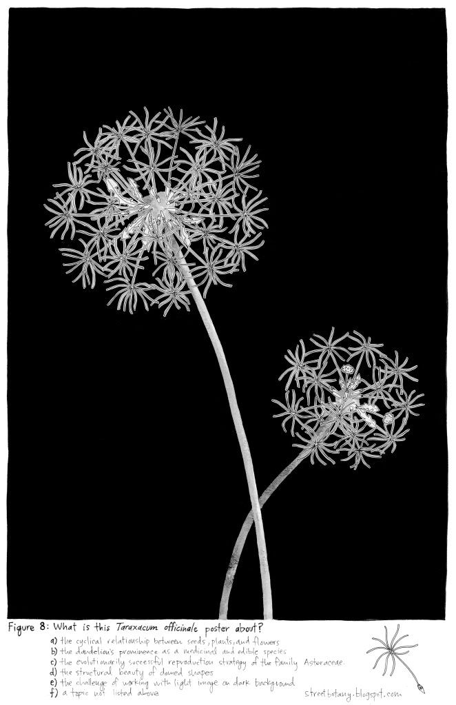
The left piece, Figure 8: Taraxicum officinale, was a drawing print of the common dandelion. It felt simultaneously familiar and alien. It seemed as though the seeds would take flight at the slightest provocation, the gentlest wind. The right piece, Figure 5: Various unidentified mosses, was a drawing print of clouds composed of mosses. They were as though islands adrift on a sea of white parchment. One of the most intriguing things about these two larger pieces was the text written at the bottom of each poster. The text gave (a) scientific information about the subject of the drawing; (b) extraneous information that was somewhat fantastical or magical in nature, but that felt like it was vital and necessary; and (c) things to ponder or look up when the viewer left the show.

These two larger pieces acted as bookends to eight smaller sketches of various types of clouds, the Cloud Cards: (A) Cumulonimbus; (B) Altocumulus; (C) Cirrostratus; (D) Nimbostratus; (E) Stratus; (F) Cirrus; (G) Fog; and (H) Cumulus. Each cloud card had (a) the name of the cloud printed out; (b) a small representation of its accompanying cloud; and (c) one line that acted as definition for the cloud. Fog was my favorite, with it feeling the "most grounded" just as its namesake cloud.

The reason this north wall of pictures resonated with me was because of how well each piece worked with the other nine on the wall. They each were able to stand alone, as well as part of the collective. The "airiness" of Figure 8 and Figure 5 was echoed in the Cloud Cards. I could have stood there for hours, focusing on the simple yet detailed lines, if it hadn't been a school night for The Child.

---

I will be visiting again. The show runs through Saturday 13 November 2010.

---

*The Child kept asking me what the tent in the back room of the gallery was. I told The Child I didn't know, but that we weren't going to go back there because it wasn't part of the exhibit. It turns out that the fabric geodesic dome (the "tent") housed many of the plants that were depicted in the drawing prints. Or so I've been told. I'll have to make sure to take a peek next time.

Thursday, October 21, 2010

THIRD THURSDAY ARTWALK


The Child and I visited Tacoma Art Museum as part of Tacoma's Third Thursday ArtWalk, where the museums are free to the public for a few hours and many of the downtown art galleries and local shops are open later.

I was eager to once again visit The Movement of Impressionism: Europe, America, and the Northwest exhibit. Highlights included two bronze sculptures by Edgar Degas, paintings and a lithograph by Pierre Auguste Renoir, and paintings by Camille Pissarro (pictured above), Eugène Louis Boudin, and Joaquin Sorolla y Bastida.


We next visited the opening of the Mighty Tacoma exhibit, which is a "snapshot" of both the City of Tacoma and the state of digital photography as art in 2010. My favorite artists were Terry Rishel and Kevin Lidtka, primarily due to the richly saturated colors in their photographs.

Terry Rishel's ink jet print Tideflats (2010) made me gasp. The "canvas" was orange and yellow, with a spot of red that was something (sawdust? grain?) piled in front of large silos. I could almost feel the heat emanating from the "flames" of the photograph. The steam from the various smokestacks felt more like smoke. I could imagine myself trying to catch my breath.

I was also struck by the geometric compositions in Morgain Bailey's untitled ink jet prints from Excerpts from the Tacoma Series.

---

After Tacoma Art Museum, we headed off to buy some small and inexpensive art from Tacoma's Art-o-mat Machine, located inside BKB & Company.

Then, it was off to the opening of Maria Jost's Street Botany show at Fulcrum Gallery, but that is a story in itself.