
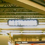
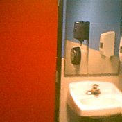


Clockwise from upper left: (1) neon restrooms sign in Home Depot; (2) men's restroom in a Taco del Mar; (3) men's restroom in a Borders; (4) men's restroom on fourth floor (red floor) of Seattle Public Library's Central Library.
Why is it that the places that we spend the most time, or time doing things that are more intimate or private, are often the places that have the least amount of thought placed into their design? In this case, it is public restrooms, but it could easily apply to our bedrooms as well. One of the best things the wife and I ever did was to get a decent mattress. Think about how much time you spend sleeping—for most people it is one-third of their life, or, in my case closer to one-quarter of my life, but I am getting better about sleeping more.
Now, to the issue at hand. Why do public restrooms, spaces where we perform necessary acts of urination and defecation, often have to be some of the ugliest spaces we inhabit, even if ever so briefly? The restrooms in places like Home Depot or Borders Books and Music surely reflect the corporate cultures of which they are a part. Those restrooms are about function, with little consideration of form. They are, however, usually quite clean. The Borders bathroom I visited was in a recently opened store, which meant that it was clean, shiny, disinfected, and sterile. I would much rather have the bathroom at Elliott Bay Books, though. It is dark and dank, sometimes odoriferous, filled with graffiti and scrawlings, but it has what the Border restroom will always lack—character.
The Taco del Mar restroom was a step in the right direction, even if it too was part of a chain store. The walls were a white laminate from the floor up to about four feet from the floor and then painted a bright blue above that. The door was painted bright red. The restroom was kept clean but felt more like a place that was used, and meant to be used, than the overly-hygienic atmosphere of the Border's restroom that almost discouraged use.
The restroom that started me thinking about public restrooms, their design, and their decor, was Seattle Public Library's Central Library. The fourth floor of the Library is the red floor. All of the exterior spaces—hallways, stairs, doors—are painted red. The meeting rooms are painted various pastel shades, as are the restrooms. The women's restroom is painted a very pale eggshell blue (yes, I peeked); the men's restroom is painted a soft mint. The contrast from hallway to restroom made the movement into the restroom one that was soothing and calming. The sinks, toilets, and urinals had rounded corners and angles, as opposed to the more rectilinear shapes of standard restroom fixtures. The urinal almost begged to be used. The sink nearly invited you to cleanse your hands. The fixtures nicely matched the feel of the rest of the Library—its art and architecture reflected in even the most basic of functions. The only urinals I can think of that felt more like pieces of art than those of the Library were those I encountered in one of the restrooms at the Woodland Park Zoo. The Library's restroom was clean, but it also had character, and was warm and inviting.
The next time you use a public restroom, take a look around and see what the restroom says about the store or space to which it is attached. It may tell you much about that very store or space. The restroom may help you decide if you really want to be where you are.
No comments:
Post a Comment